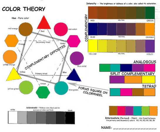
My favorite Color Theory is the yellow violet intensity.
|
My favorite Color Theory is the yellow violet intensity.
0 Comments
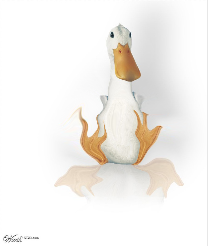
In this tutorial, I made six photos. Emphasis is the first one in which I gave color to the star on the far right. Sepia is the second, in which I edited the colors. Silhouette is the third, in which I cropped the penguins out and turned the darkness way up. Black and White is the fourth, in which I turned off the color. Double exposure is the fifth, in which I put the woman's face on top of the background and turned down the opacity and the sixth is boat in hand, which is where you make it look like something is really big.
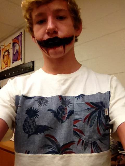 My class used trompe l'oeil which means "art that fools the eye" to make these wounds. I started with putting latex in the form of the cuts. Next, I made a slit down the center of the latex after it had dried. After that, I used oil-based make for bruises on the outside. Then, I painted inside the latex with black and around the slit with red.
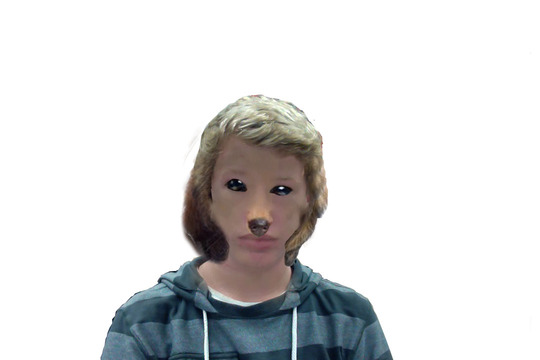
 I think photoshop can be a good thing if it isn't used for people. It could be used for backgrounds but not to make someone look skinnier or taller. I like using photoshop for my own drawings and pictures.
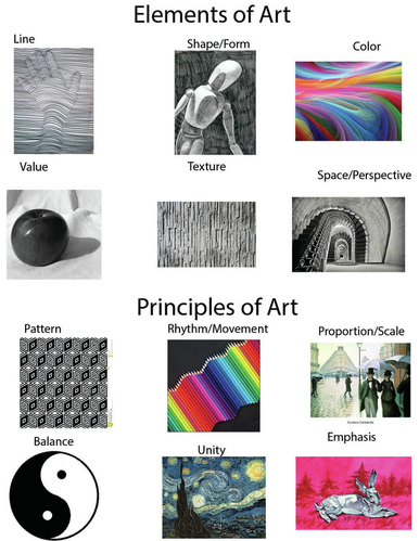 My favorite element is color, because color can make a picture feel a certain way. My favorite principle is emphasis because it makes a certain thing in a drawing pop out. E and P
|
AuthorWrite something about yourself. No need to be fancy, just an overview. Archives
January 2016
Categories |

 RSS Feed
